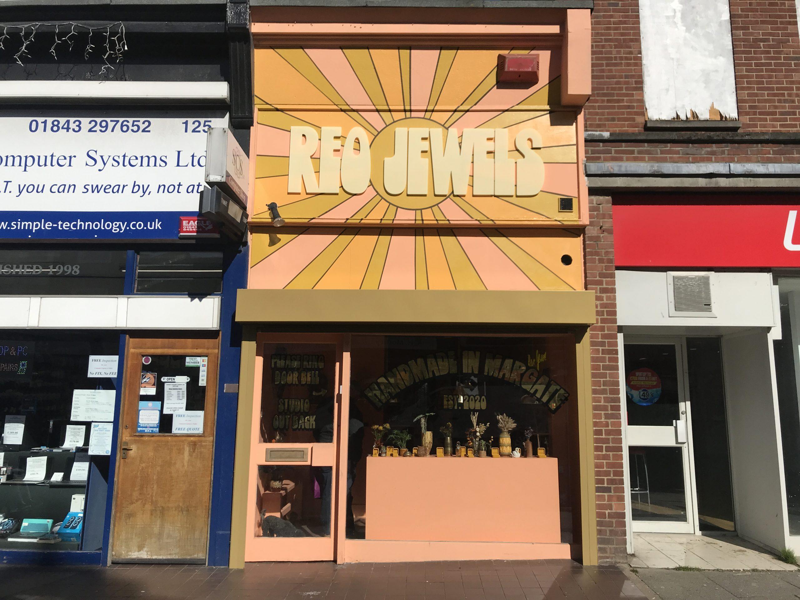
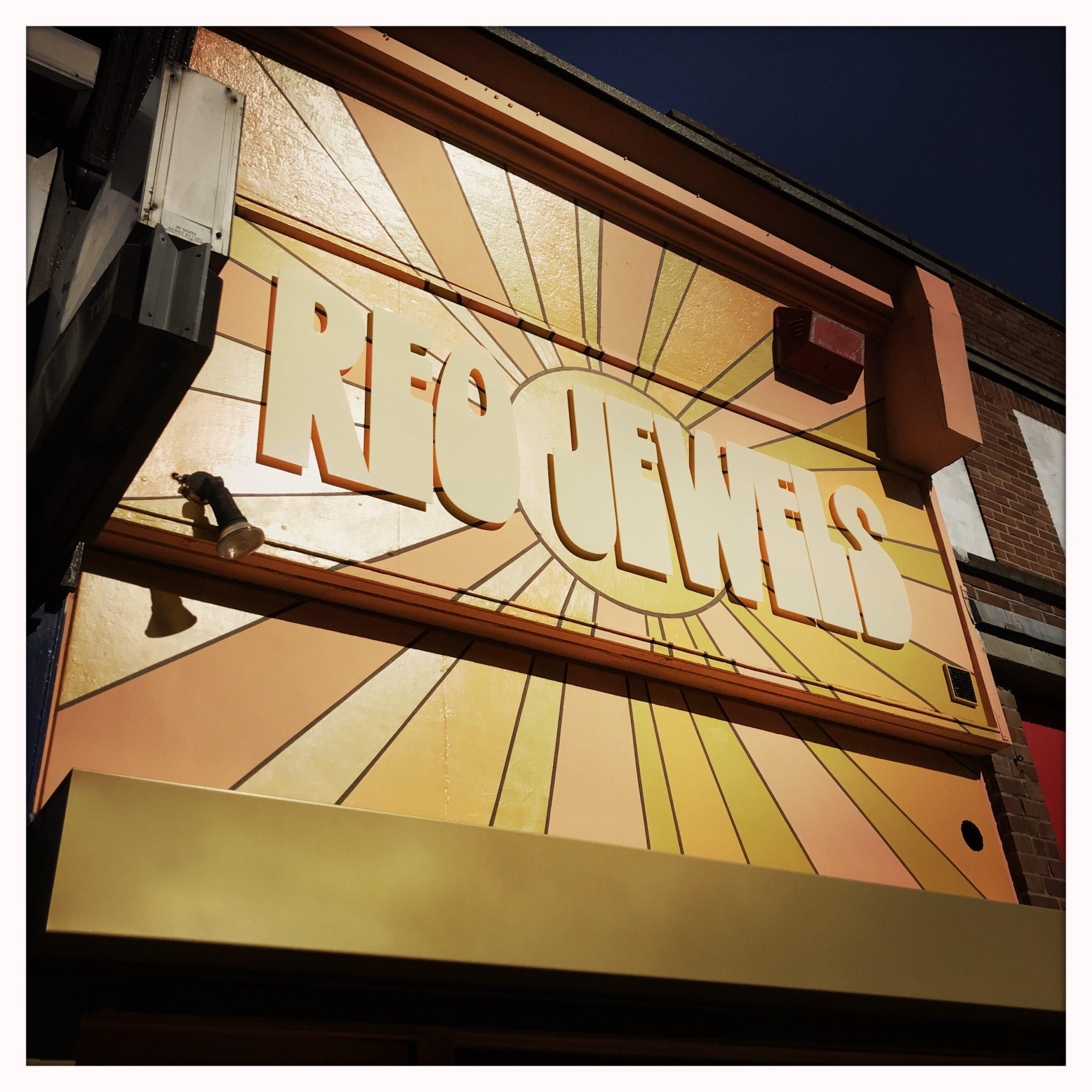
Collaboration with Reo Jewels on their gold-covered window and fascia. Creating a unique and visually striking storefront is a key element of attracting customers and making a solid first impression. The retro-looking lettering you opted for perfectly captures the aesthetic of Reo Jewels and creates an instantly recognisable brand identity.
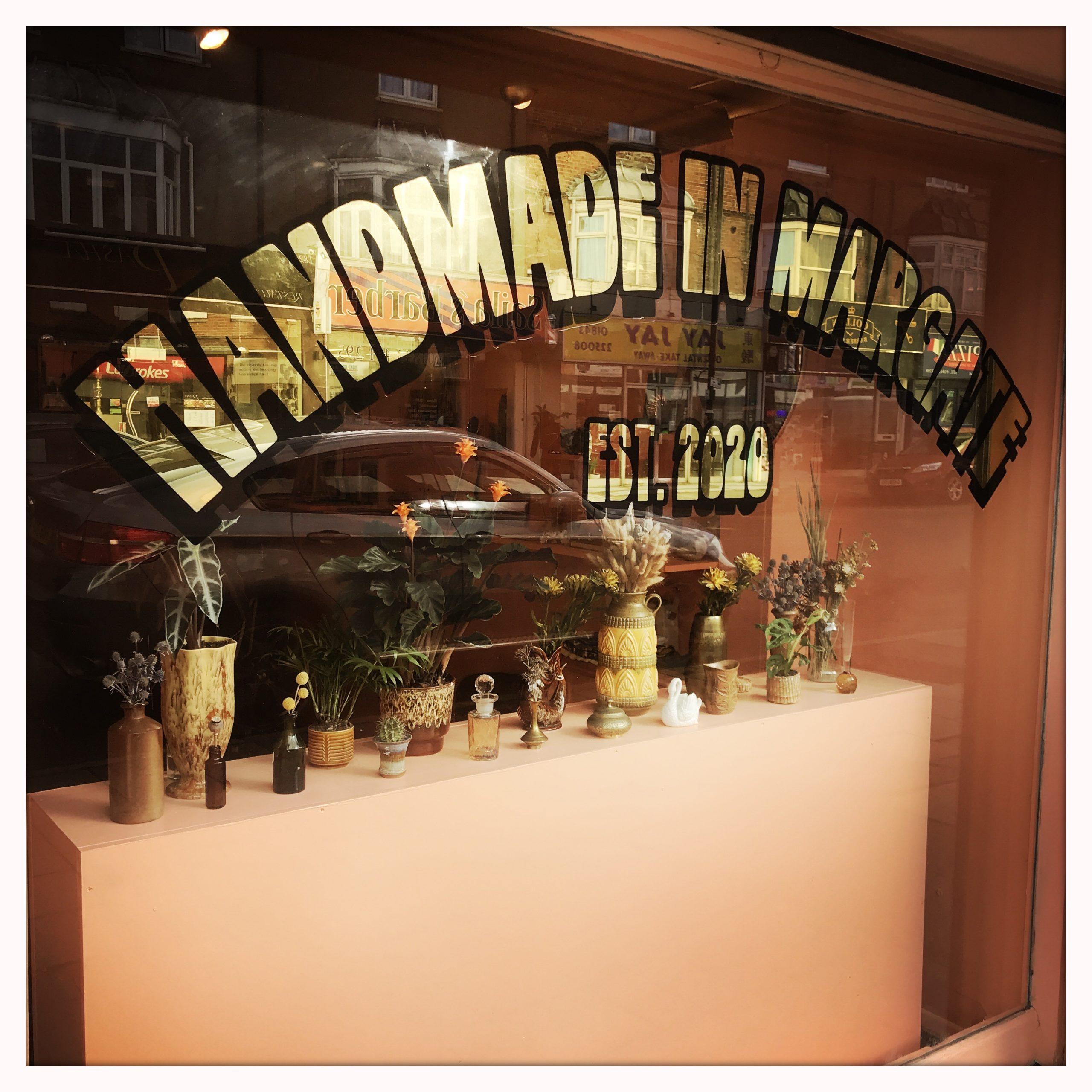
To achieve this look, I painted and gilded a reverse-glass statement with 23ct gold on their display window, framing their year-round displays with a touch of glamour and sophistication. The use of gold leaf adds a sense of luxury and exclusivity, making Reo Jewels stand out in a competitive market. Additionally, you painted their logo background onto the three-depth fascia, which is an essential part of any storefront. The fascia is often the first thing that people see when walking past a store, so it’s crucial to make a bold and memorable statement. By painting the logo background onto the fascia, you created a cohesive look that ties the entire storefront together. To make the logo stand out even more, 3D cut letters were applied to the fascia. This technique adds depth and dimension to the storefront, creating a dynamic and eye-catching display that is sure to grab the attention of passersby.
The use of gold leaf and other traditional signwriting techniques not only adds a touch of stylishness and sophism but also helps to create a sense of authenticity and craftsmanship that is often lacking in today’s world of mass-produced signage.